A drinks brand inspired by Italian futurism and aperitivo culture. Created for modern, design-conscious drinkers, the brand blends bold visual energy with a fresh take on the classic pre-dinner ritual.
Sorso Aperitivo
Brand
Packaging
Digital
Sorso Aperitivo is a drinks brand inspired by Italian futurism, aiming to bring a bold, modern twist to the traditional aperitivo. The identity uses expressive type, geometric shapes, and dynamic compositions to create a visual world that feels playful, energetic, and distinctly Italian. The colour palette and styling take cues from vintage posters and packaging, but are reinterpreted in a more refined, editorial way. The overall tone strikes a balance between nostalgia and modernity, giving the brand a vibrant but considered personality.
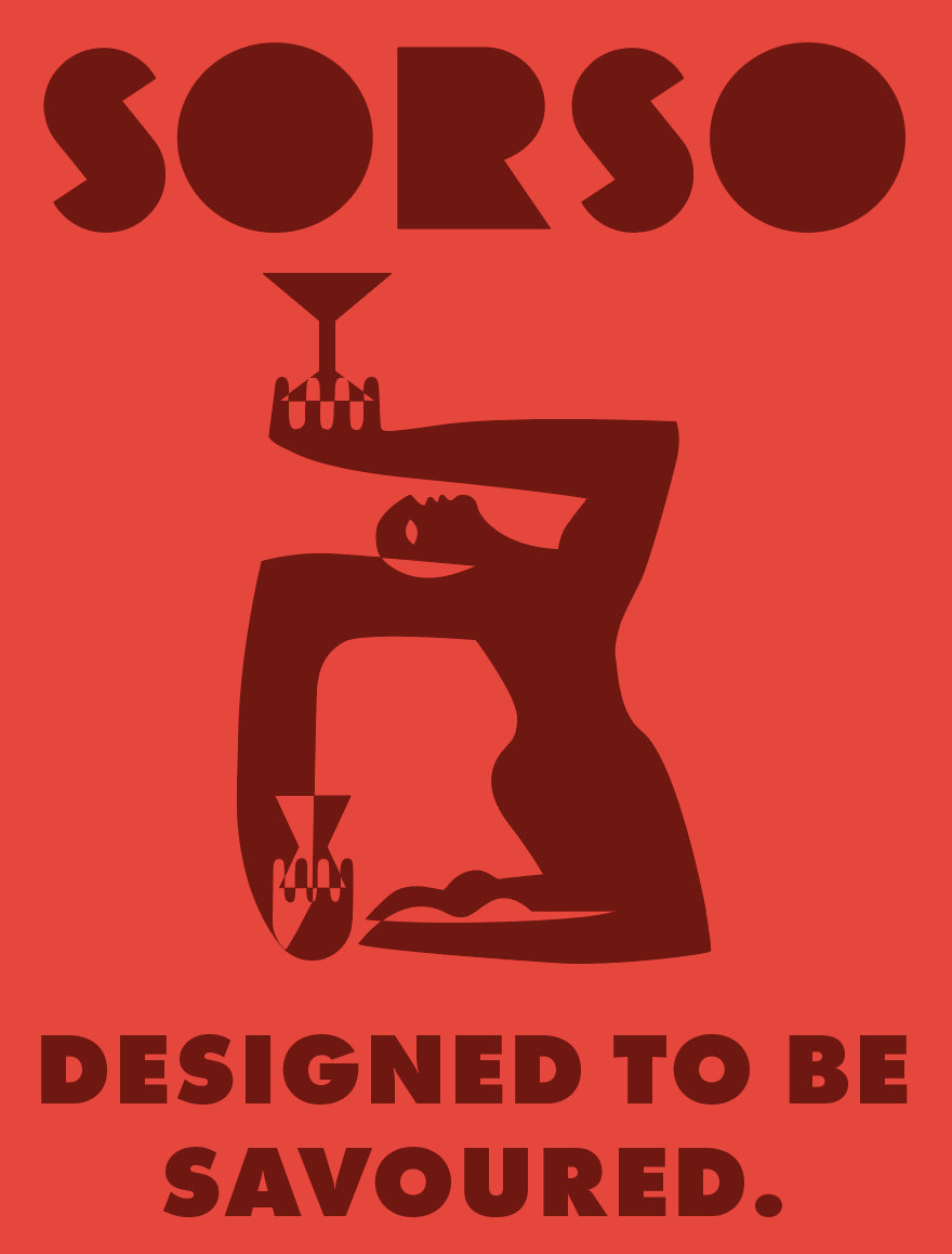
Above: poster design
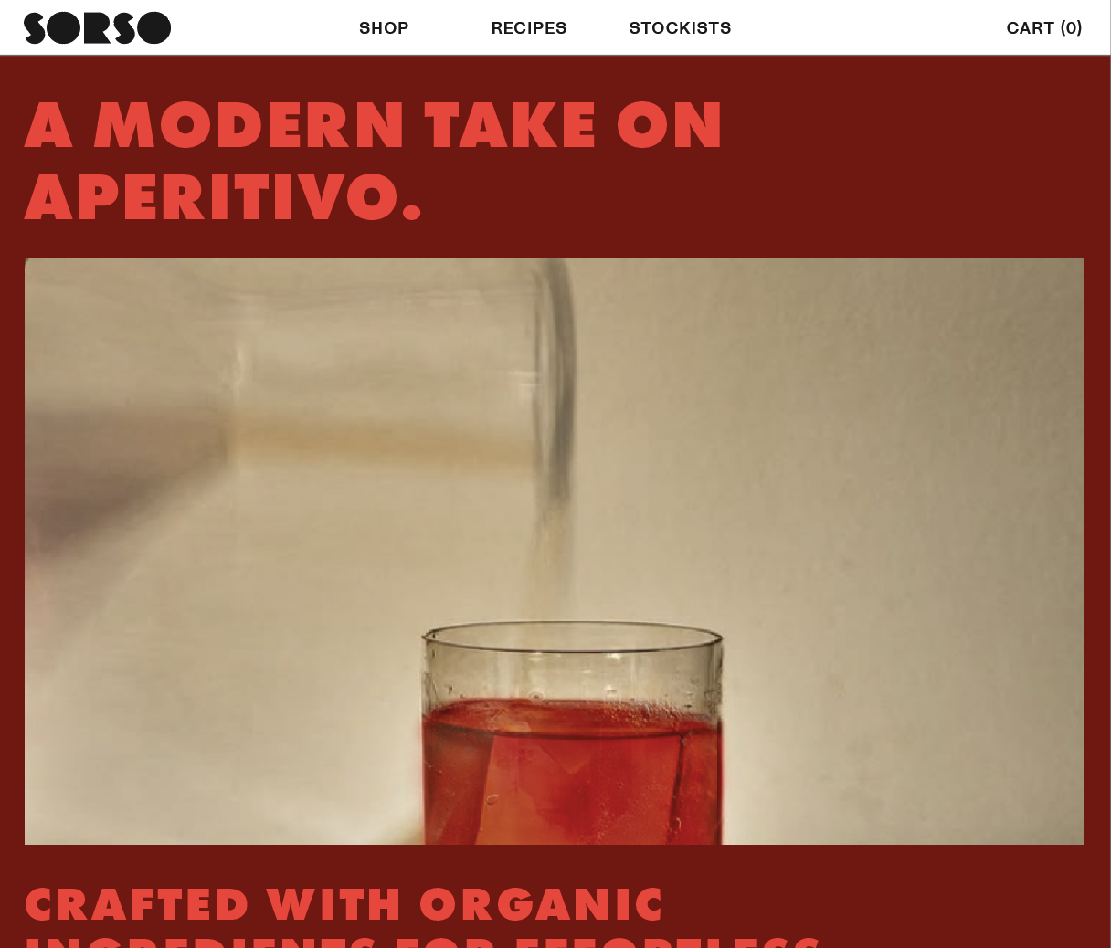
Above: website homepage
The packaging system was designed to stand out on shelf with bold typographic messaging, structured layouts, and bright, layered colour blocking. Messaging such as "Designed to be savoured" sets the tone for the brand’s positioning — expressive, thoughtful, and flavour-led. While the visuals feel energetic and playful, careful attention to hierarchy and spacing gives the packaging a premium, design-forward feel. The result is a confident brand presence that appeals to both visually driven and lifestyle-oriented audiences.
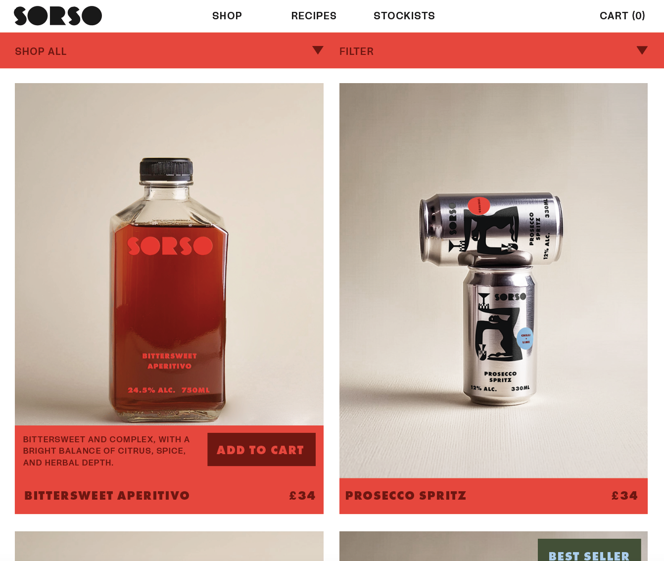
The website brings the Sorso identity into a digital space, maintaining the brand’s bold visual energy while delivering a smooth, easy-to-navigate user experience. Designed with large-scale typography, vibrant imagery, and clear content sections, the layout feels editorial and immersive. The site introduces the brand story, products, and culture in a way that mirrors the tone of the packaging — playful, polished, and built around enjoying the ritual of aperitivo in a fresh, modern way.
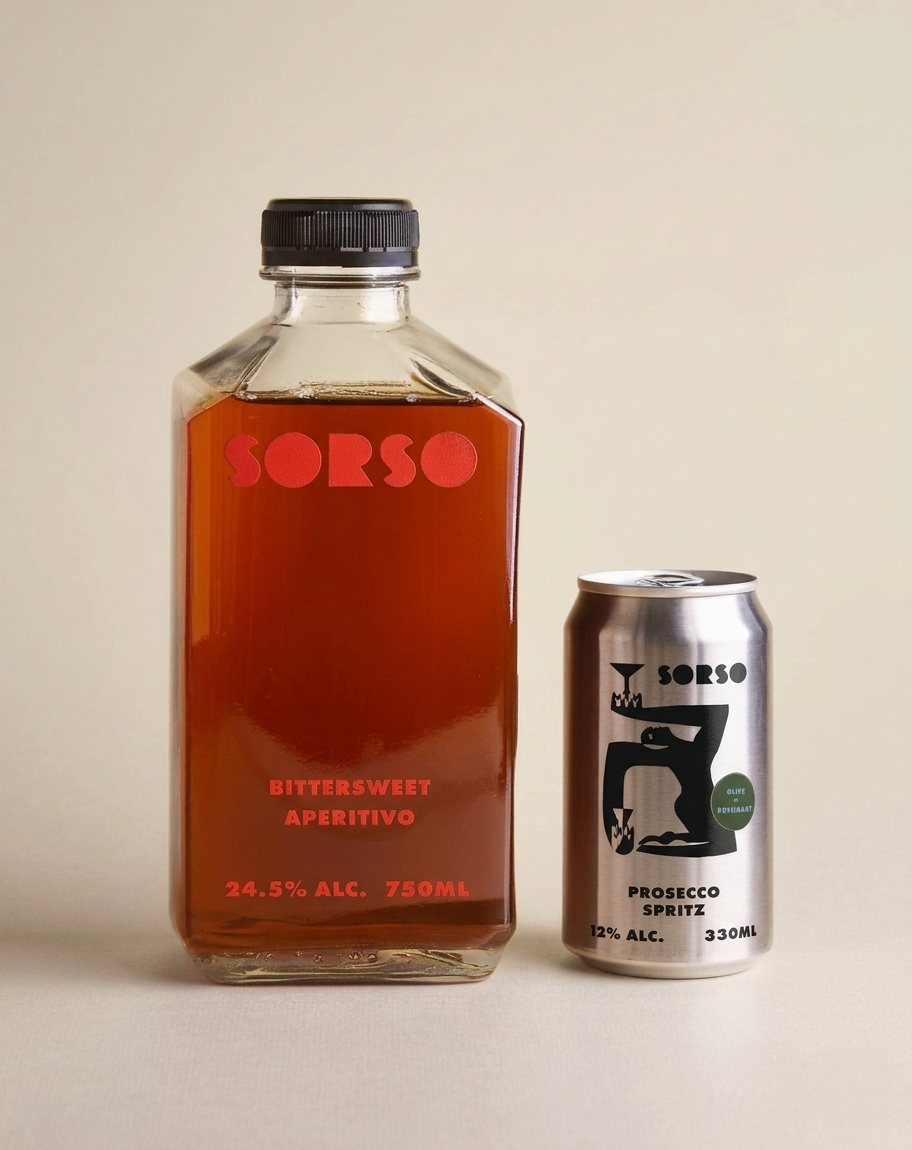
Above: packaging design