A sustainable lifestyle brand rooted in the five senses, with its first product — a 0% alcohol fragrance set — representing “smell.” Inspired by Indian heritage and crafted with low-impact materials, the brand offers a slow, personal approach to modern self-care.
Dilli House
Brand
Packaging
Print
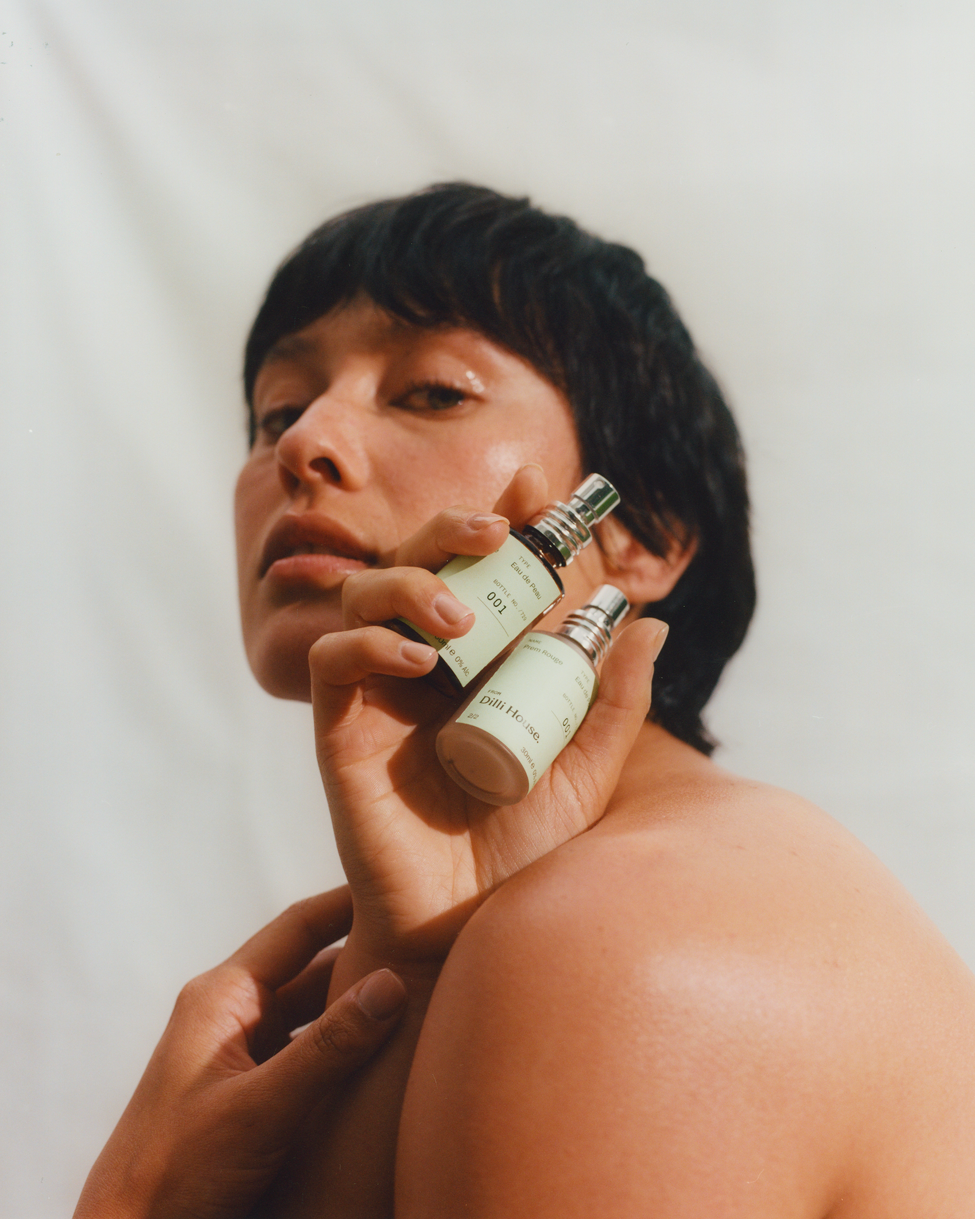
Dilli House is a sustainable lifestyle brand inspired by the five senses, with its first product focused on "smell" - an alcohol-free, layerable fragrance set. The brand identity needed to reflect both Indian heritage and a contemporary Western design sensibility. The visual language pairs natural, muted tones with considered typographic choices. A soft lime green was selected as the primary colour, referencing the vibrancy of traditional Indian colours, while feeling modern and understated in tone. The logotype was chosen for its curved, expressive letterforms that subtly echo the flow of Indian script while maintaining clarity and elegance.
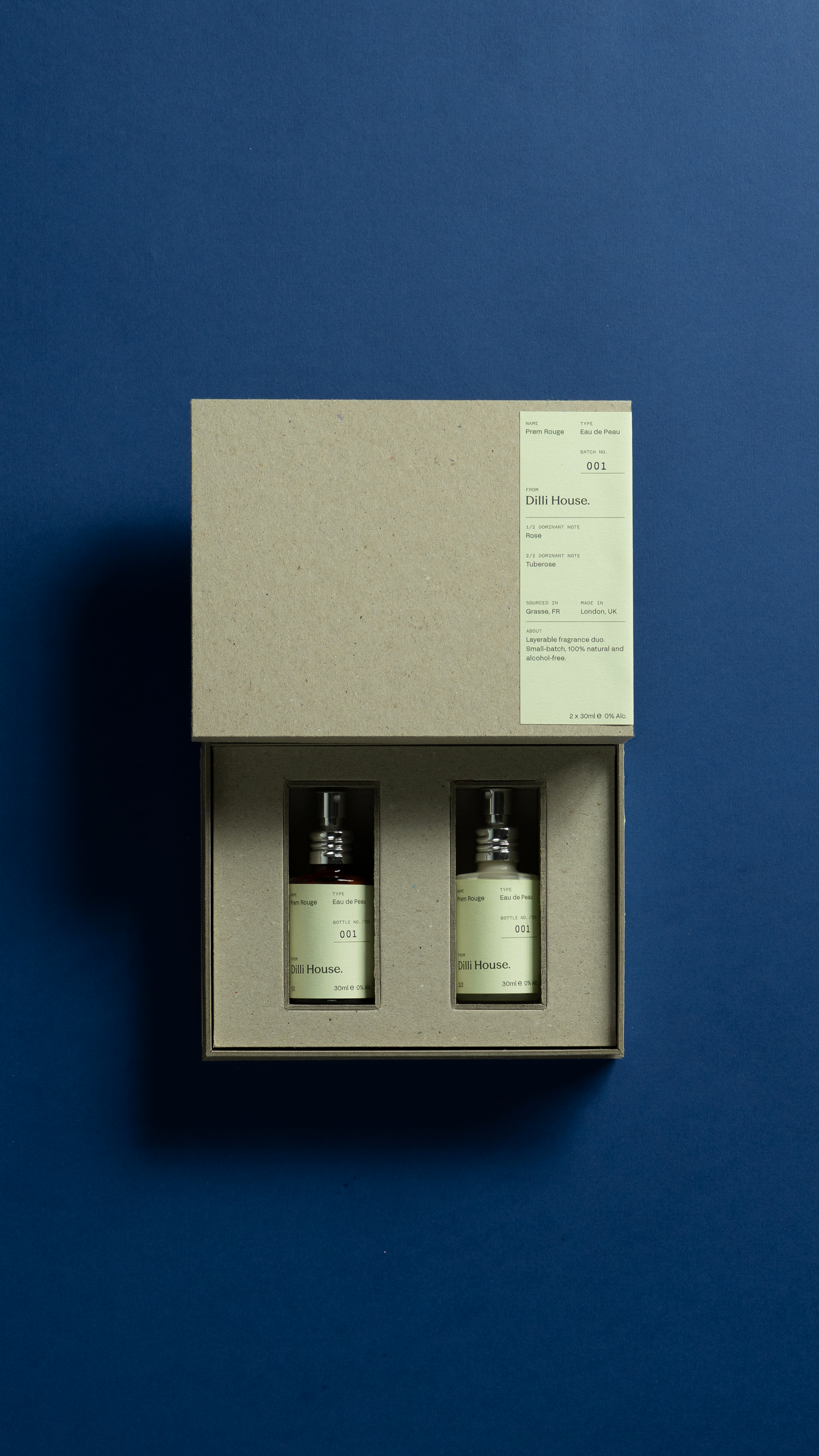
Above: box design
Packaging
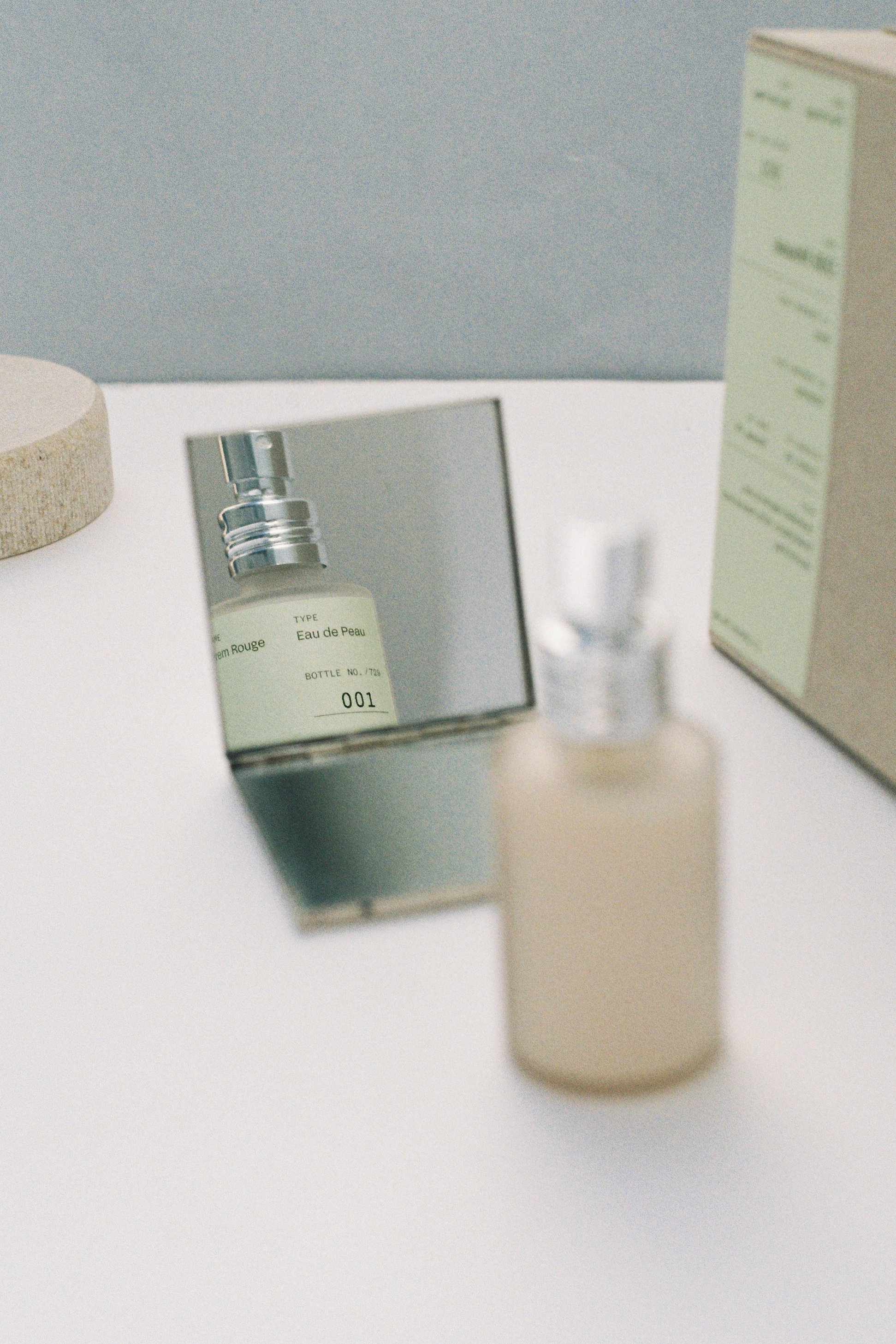
Above: bottle design
Web
The website mirrors the brand's quiet, archival feel - spacious layouts, tactile imagery, and understated type create a browsing experience that's editorial and sensory. With only one product available at a time, a fixed sidebar keeps the purchase button always visible, while users scroll through content at their own pace. Visual elements from the packaging carry through, with linear dividers breaking information into clear sections.
Above: mobile website
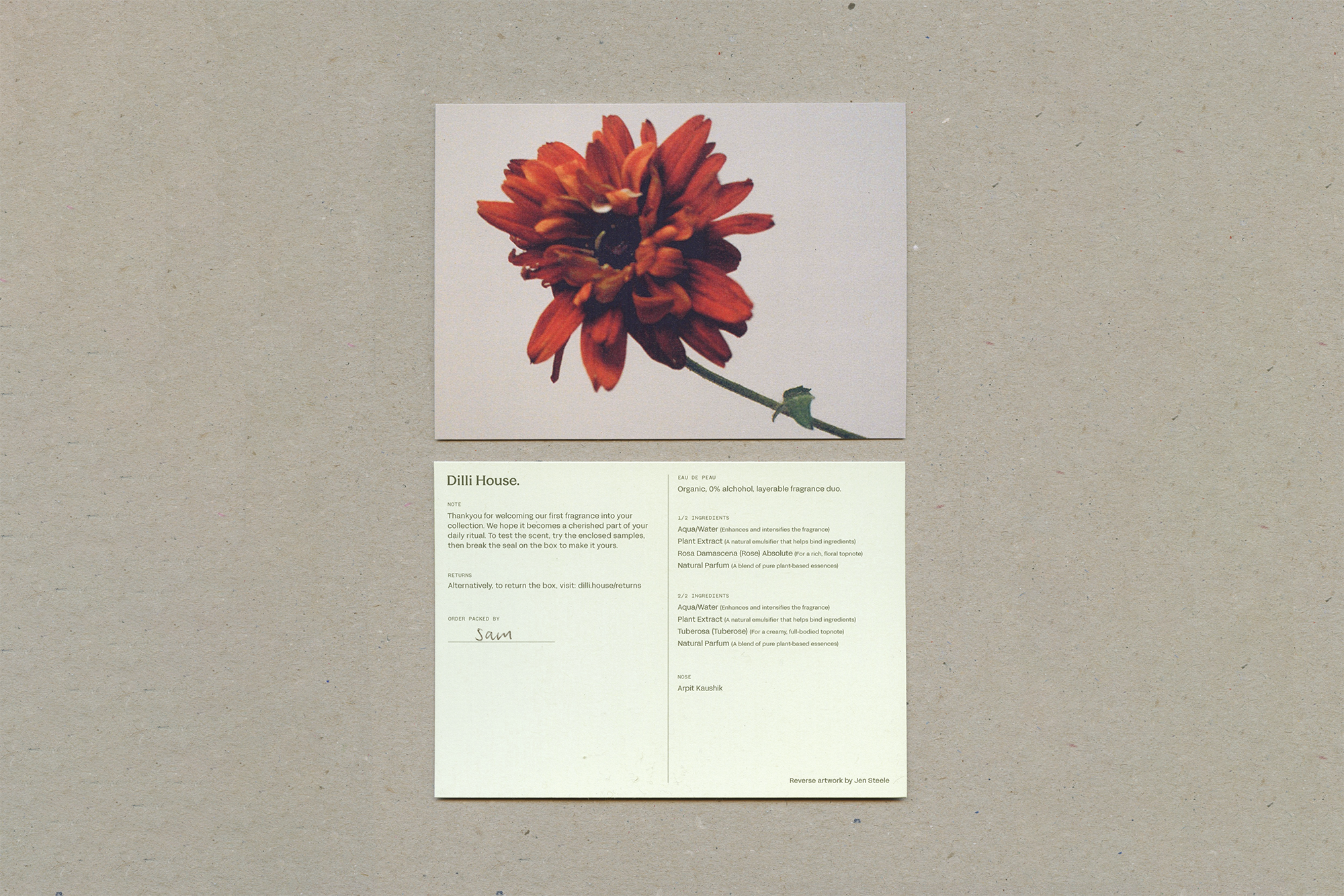
Above: packaging postcards
Above: desktop website
Packaging development was centered on low-impact materials and small-batch production. All components were specified as recyclable or biodegradable, with the inclusion of reusable glass bottles and UK suppliers to reduce environmental impact. Small-batch details were emphasised through hand-stamped batch and bottle numbers handwritten packer names, and artist signatures.
Above: bottle labels
Print Assets
A supporting set of printed materials was designed to extend the brand’s tone across additional touchpoints. These included postcards, batch labels, and business cards, all created with an emphasis on tactility and visual consistency. Typography, layout, and material choices were carefully considered to ensure alignment with the brand’s crafted and personal feel, while maintaining usability across day-to-day applications.
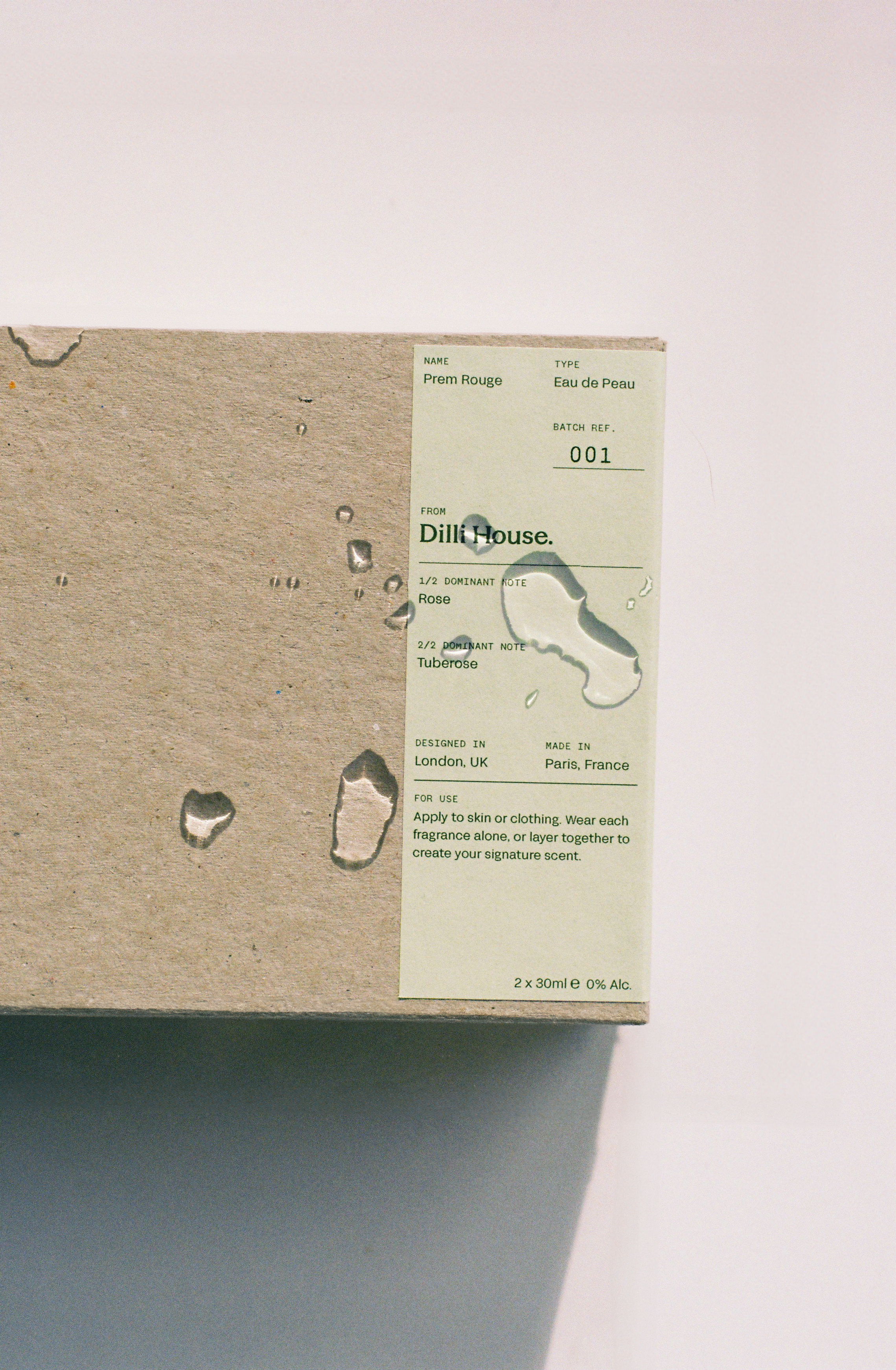
Above: box label design