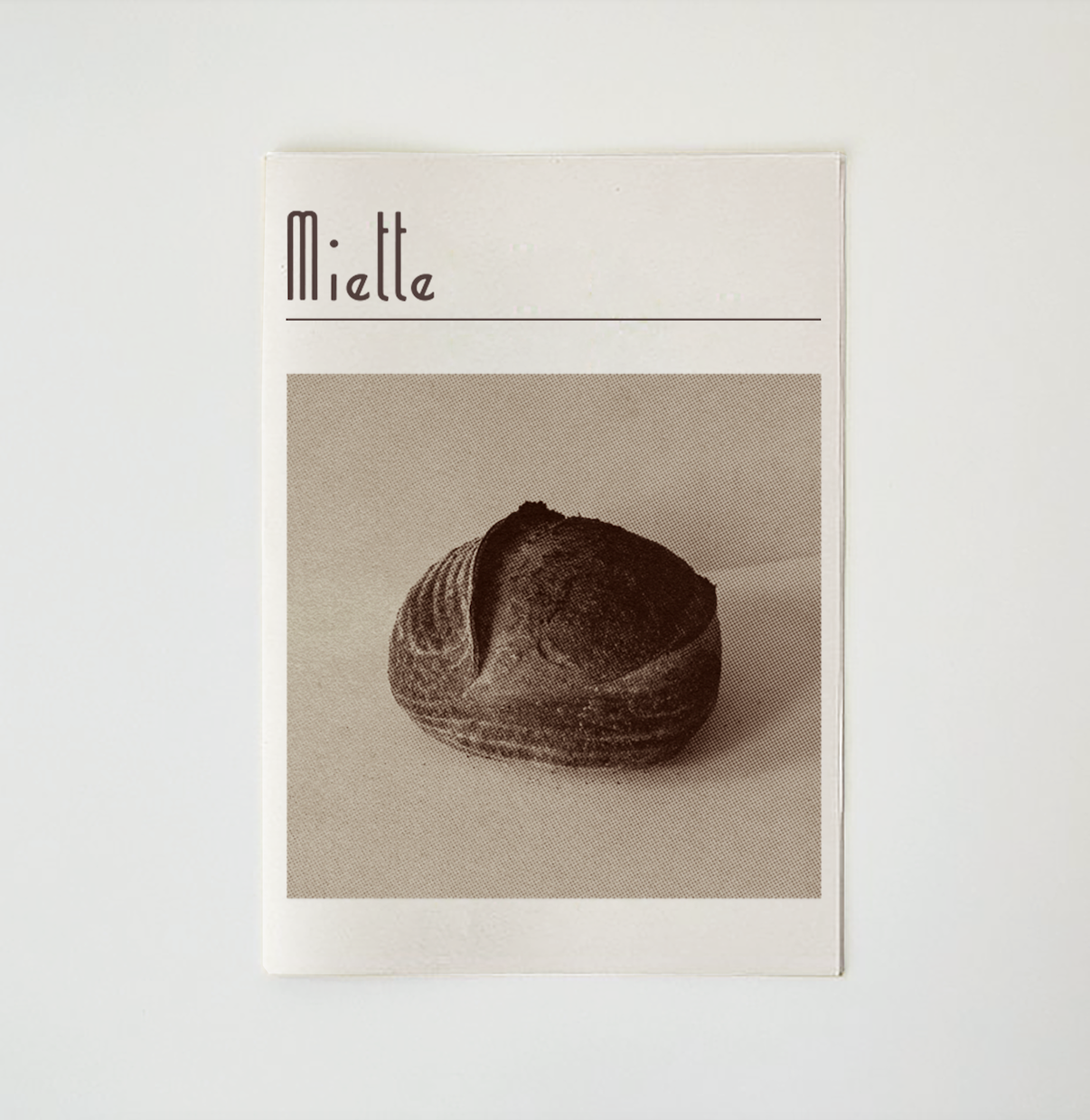
Miette, meaning crumb or small sweet thing, is a French/European inspired bakery based in London. The identity explores softness, movement, and character — drawing from the tactile process of baking and the elegant simplicity of classic patisserie branding.
Miette
Brand
Packaging
Print
The Miette brand identity was shaped by the idea of transformation — specifically, the rising and folding nature of dough. This was expressed through rising and falling line work, and a typographic system that shifts in structure and rhythm. The design draws on subtle French visual cues without feeling pastiche, using clean serif type, warm neutrals, and lightly nostalgic flourishes. The tone is gentle but characterful, with a hand-drawn logotype and fluid layout decisions giving the identity a crafted, considered quality.
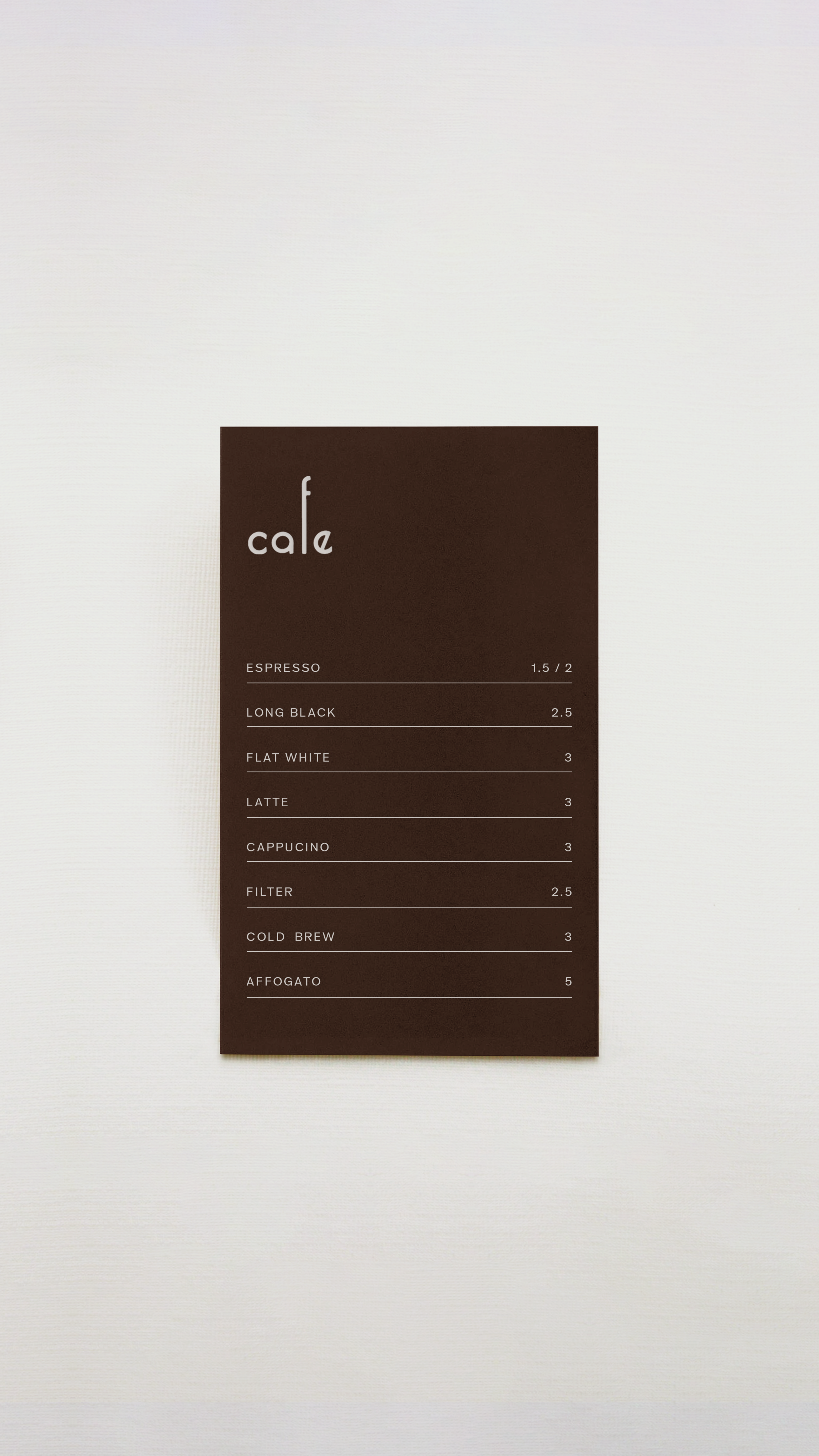
Above: drinks menu
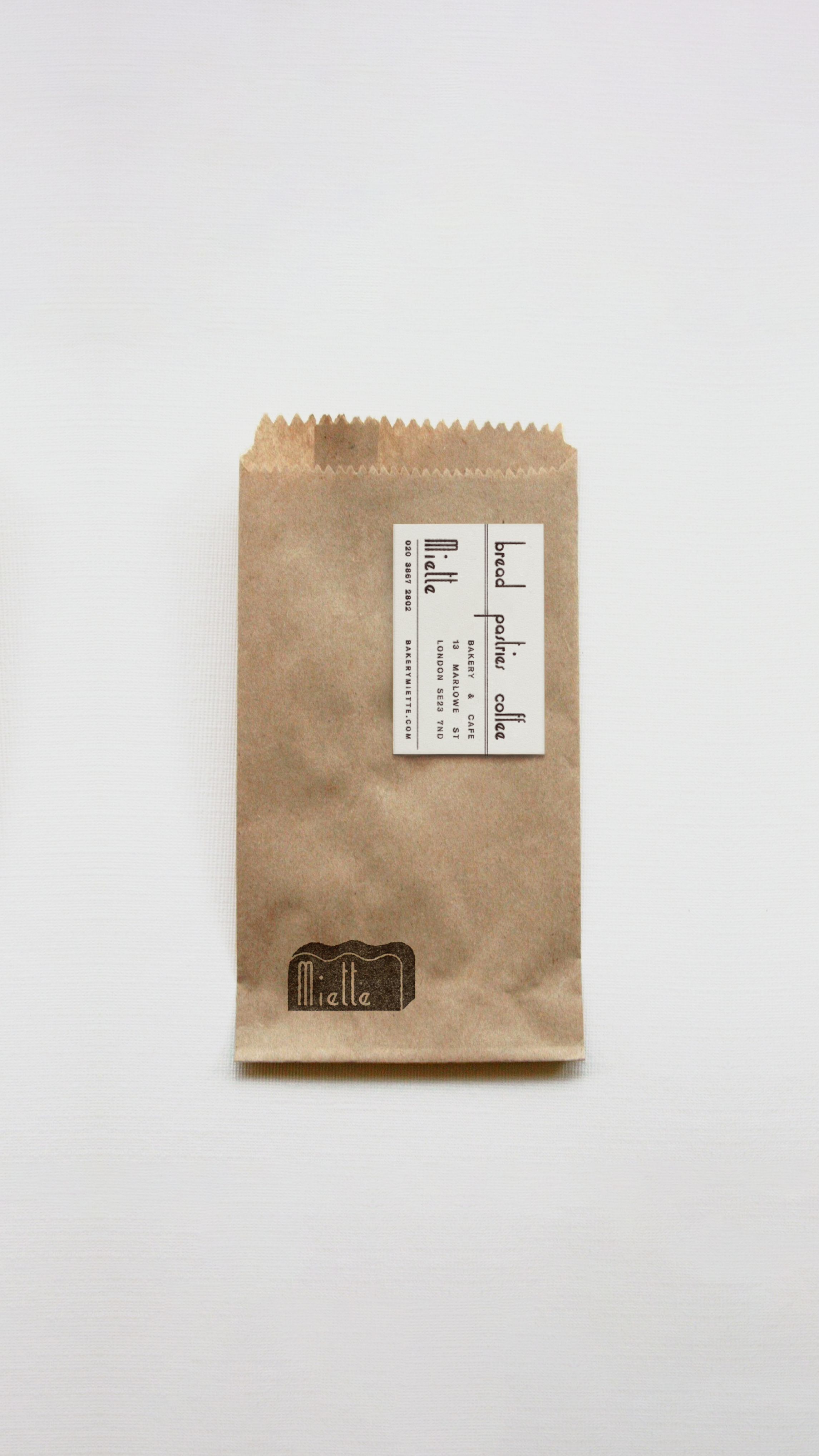
Above: packaging
Printed materials were designed to support both the tactile and refined feel of the brand. These included packaging elements like pastry bags, takeaway labels, and a simple menu — all focused on delivering a consistent yet light-touch aesthetic. Typography was carefully paired with open, minimal layouts to evoke a sense of ease and clarity. The print system brings warmth to a neutral palette through material choices and small details, keeping the brand feeling personal and handmade, without losing its elegance.